
A Visual Language for Coffee.
This project focused on designing a premium coffee packaging line rooted in Latin American tradition. The goal was to create a visual identity that feels high-end yet approachable, while highlighting the origins and character of each roast. The packaging balances minimal typography with subtle details, allowing the brand’s story to stand out without distraction.

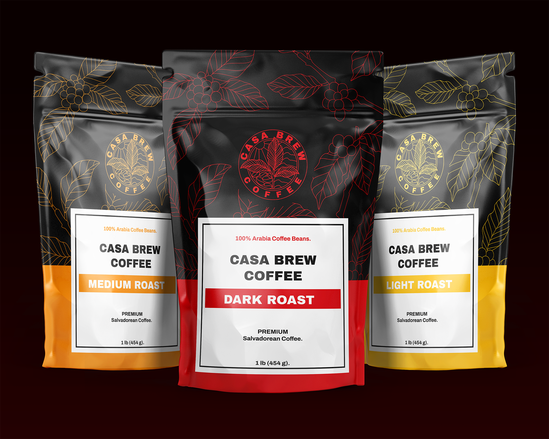
The final system includes three variations: dark, medium, and light roast. Each designed to stand on its own while remaining part of a unified whole. The goal was to create clear differentiation between roasts without losing consistency in the overall identity. Each variation carries subtle shifts in tone and composition, giving the line visual balance and flexibility while ensuring it feels cohesive as a family.

